Themes - Which Layout To Choose

You’ve taken the plunge to build your own website (excellent decision, might I add) and the first step is to choose your theme. This is probably the hardest decision you’ll have to make outright with a lot of factors to consider when asking what do you want your website to look like?
Full width images or boxed width?
Multiple pages or anchored scrolling?
E-commerce facilities?
Does your site need to be responsive?
Where does the menu bar go?
Adverts? Yes? No? How many?
Should I have whitespace or blackspace?
How much text is too much for the homepage?
Pretty overwhelming but the biggest question is how much time and effort can you put in? Let’s have a look at the above in more detail.
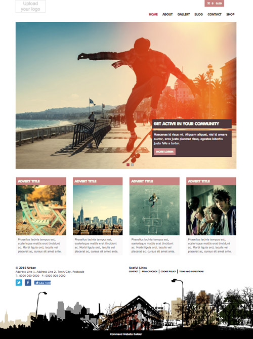
Full width images or boxed width?
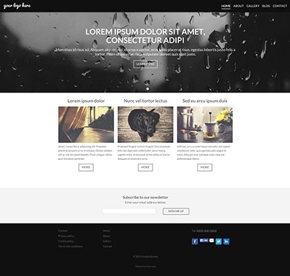
The boxed width is used by a lot of professions creating clean lines on the images. This also allows content to stay pretty much the same when flipping between mobile/desktop and other screen resolutions. Check out Great Ormond Street Hospital.
The full width images are becoming more popular, giving an impression that the site can has no boundaries, popular with creative designs and clothing stores (ASOS is a classic example). Just make sure the edges of the images aren’t the most important parts if they may be cut off.
Multiple pages or anchored scrolling?
This will depend a great deal on the nature of your site. Do you have a lot of content or is your website to have a few great images, contact details and a bit of blurb?
For SEO purposes and natural ranking, we would suggest multiple pages. Or an anchored home page with a link to your blog. The more content you produce, the more search terms are available on your site for you to organically climb up the ranks when users are searching for businesses like yours.
Check out our Tour page for an (awesome) example of an anchored scroll page.
Ecommerce Facilities
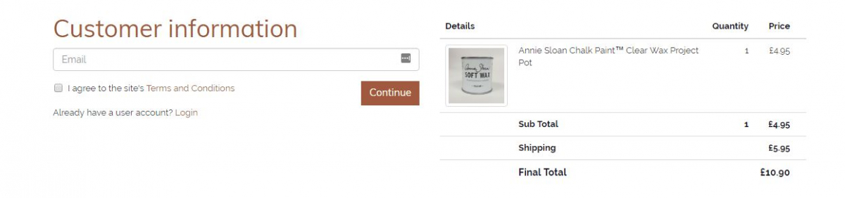
This will of course depend on whether you have something to sell. Clothes, crafts, merchandise, gig tickets, prints… pretty much anything that can be shipped you can put onto your online store. Ensuring the order process is as seamless as possible is key, with too many steps and fiddly options customers can get bored and drop off thinking “I’ll do it later” only never to return!
Does your site need to be responsive?
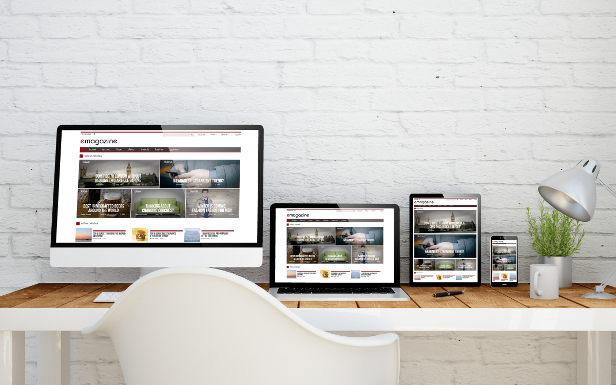
This is just a big fat yes. A responsive website will alter its appearance to suit the user’s device, orientation and behaviour. Content can be resized or moved to suit the viewing platform without compromising on the aesthetics. No one likes having to zoom in to the desktop version of a site on a mobile, so all Kommand sites are responsive. Yay!
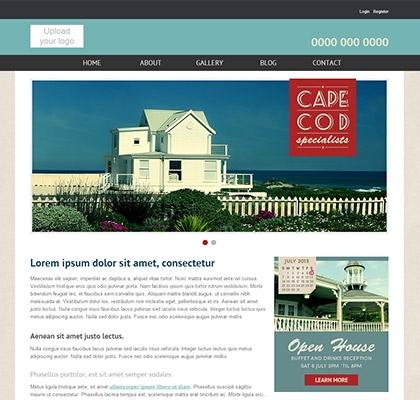
Where does the menu bar go?
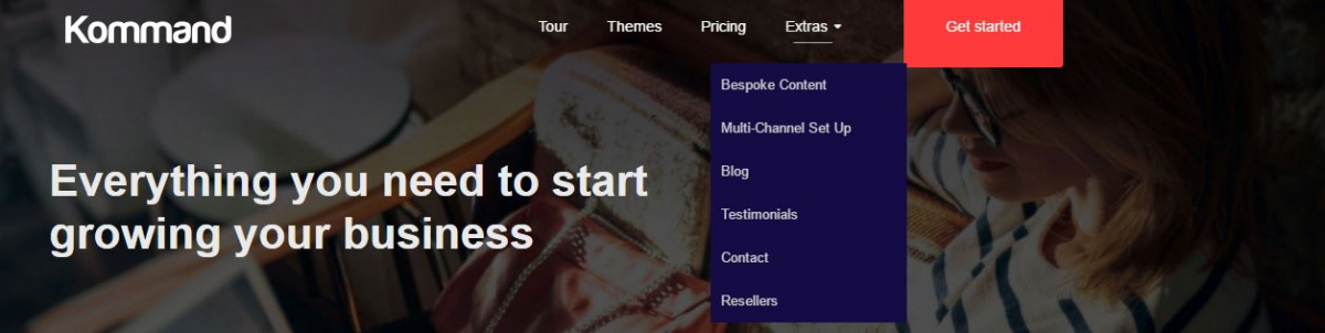
Top, bottom, left, right, you can choose where it goes. Is it however, almost always at the top as this helps direct users to the content they are looking for without scrolling. Though the other popular option is to have this below a featured image, especially as we take a more visual approach to web design. To further minimalise the menu bar, you can go for a drop-down option and further still a Hamburger drop-down.
.jpg)
Adverts? Yes? No? How many?
We’re not talking about selling off space on your site to get some cash in, but the rotating ads, banners, image slideshows to advertise yourself! These can be used to promote new products or push users to key parts of your site with a CTA button. Don’t overdo it with the rotating ads, these can either switch too quick for users to register the content or they will navigate elsewhere before seeing them all.
Should I have whitespace or blackspace?

This will depend on the nature of your site and industry. Whitespace tends to be the most popular and easier to read, just take a look at some of your favourite sites. If you want to escape from the norm and use a black or colour space instead, think about the text colour too. White text on a black background can be difficult to read in paragraphs as the light reflects and scatters into other words. Try a grey or tinted text.
However, when users are scanning text such as headings or logos, white text on a dark background can appear more vibrant and grab attention as scanning does not put stress on the user’s eyes.
How much text is too much for the homepage?
Let’s face it, in today’s age we’ve become a little lazy. Faced with reading a full article or a condensed overview, we’ll go for the condensed option. Then if it interested us enough, go on to read the full article. This works with your web pages. If a user can’t easily find what they’re looking for or it takes too long to load, chances are they’ll head back to the search engine. This way, on the homepage, you can have a few condensed sections of text which then lead to pages with more detailed content. Ideally you would be looking for 300 words minimum on your home page for SEO purposes.
The most important thing to consider is the organisation of your text into easy managed sections with the most important areas at the top without the need to scroll.
- Tagged as: